FarmWorks
Have you ever come across a community-oriented, volunteer-driven, for-profit organization? FarmWorks operates in Nova Scotia by taking investor funds and using it to give loans and services to local food-based small businesses that need a hand. Restaurants, farmers, and everything in between. It’s an inspiring idea and a successful model, but their branding wasn’t quite pulling its weight:
The majority of their investors use RRSPs to contribute, which means that these individuals are risking their retirement to help their community for a modest return. When I took on the job, I figured that FarmWorks was competing with the likes of banks and credit unions - not just for citizens investing for retirement, but for small business owners needing financial assistance. As a result, I knew the branding had to be a mix of professional and community-oriented.
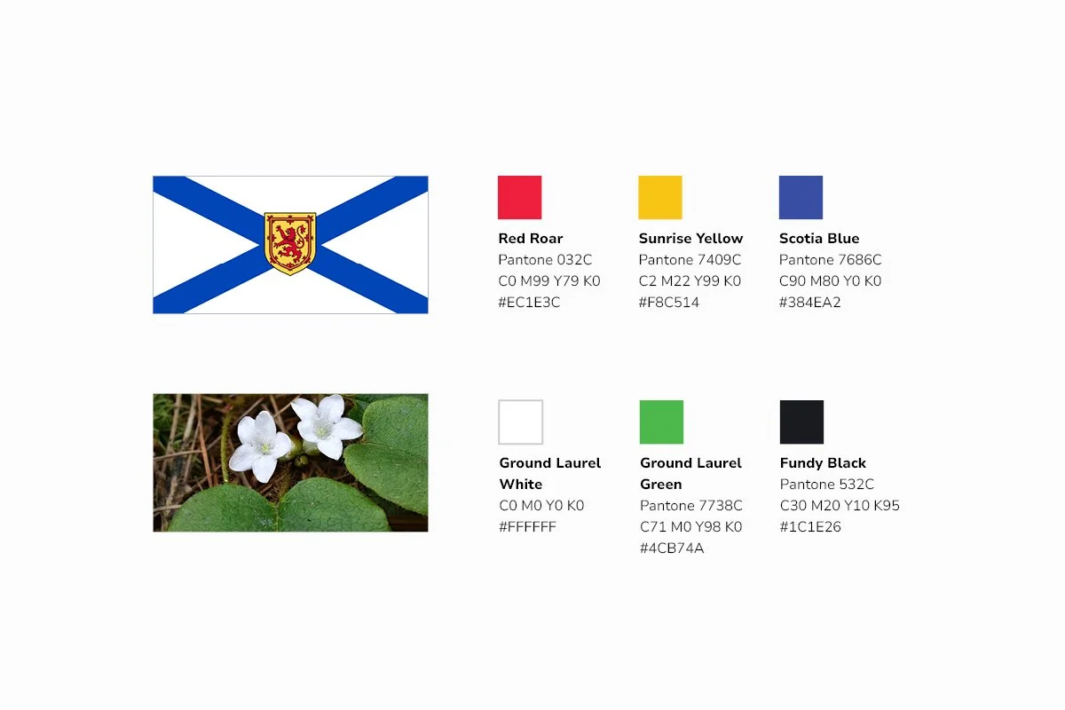
The wordmark features a typeface reminiscent of old community newspapers, with some slight enhancements to bring the letters closer together and hint at the agricultural heart of the organization. While it’s always shown in a contrasting off-black to add authority, the surrounding visual language features striking illustrations that combine local landmarks with local produce, photos of FarmWorks’ clients at work, small icons for the various products, and a friendly typeface for headlines. Add in a vivid palette inspired by the province, and FarmWorks is equipped with a visual brand (and copy style) that’s flexible, striking, and ready to work for the people working to feed Nova Scotians.


