Hopyard Hens
A city girl and an IT admin get married and move their family out to the countryside to escape expensive rent. They find a big house on a small acreage for rent, and all they need to do is keep the grass mowed. But what if they filled some of that yard space with a flock of chickens? And thus Hopyard Hens came to be; it’s a small and local business fueled by an unexpected passion for the clucky little critters. They mainly sell organic and free-range eggs, with a bit of chicken trading and selling on the side. It may be a hobby farm, but it’s run on serious commitment and joy.
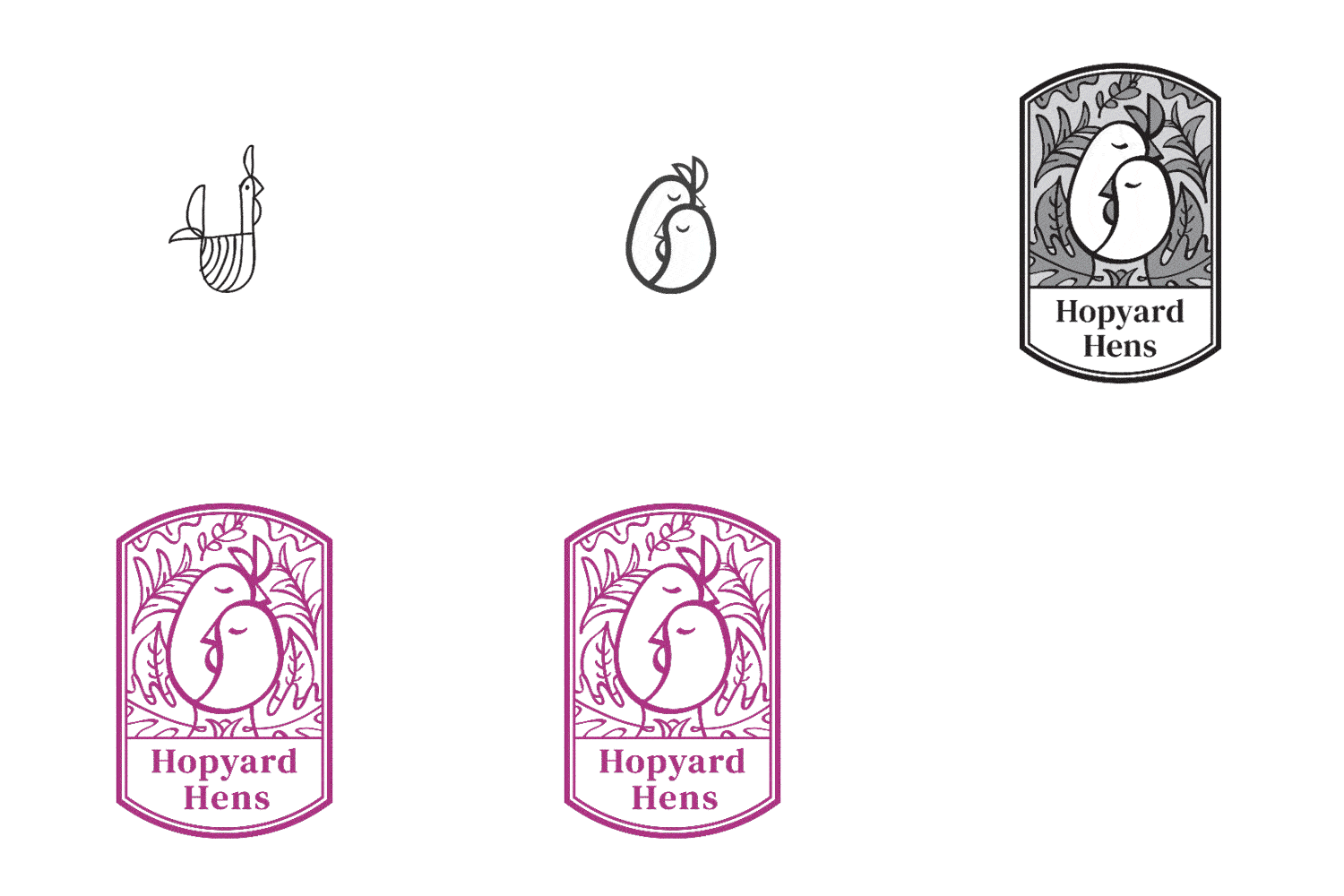
This grassroots excitement and care are what I aimed to capture through the branding. An elegant seal-type logo references the classic chicken and egg question, while being designed to work as a stamp applied to various materials. Collateral is backed up with floral gauche illustrations from early 20th century France, which inspired the vivid palette and reinforces the quality and organic nature of the business. And as for the copywriting, well, that’s driven by the owners themselves. Sometimes a small business can pack a big attitude.


